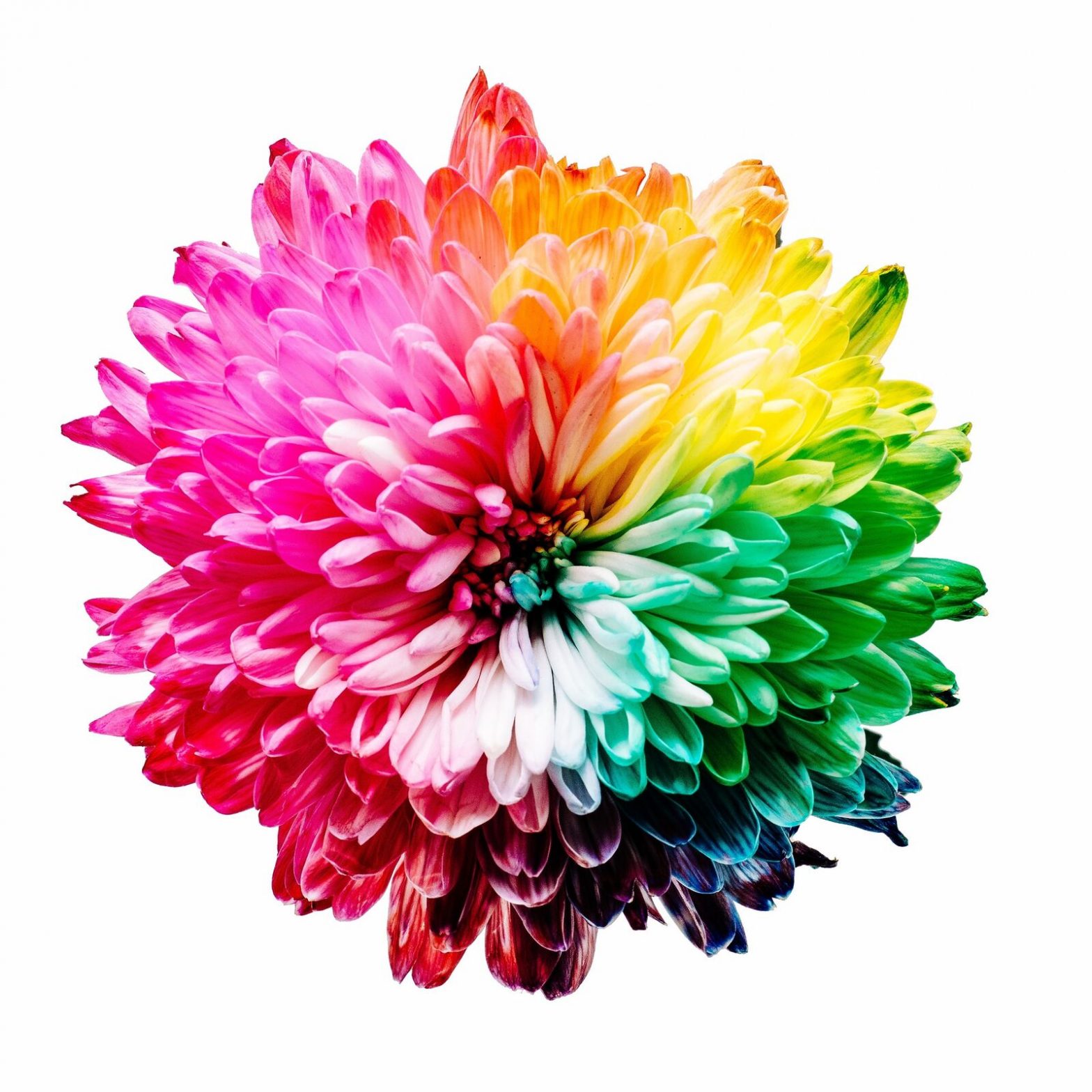
The colours of your restaurant certainly has a strong impact on determining your customers dining experience. This, in turn, determines the brand image of your restaurant. Does your restaurant provide more of a fine-dining experience? Or a fast-food experience? What about sustainable dining?
This article will help you decide which colours would be best for your restaurant and determining your brand image.
1. Warm Colours versus Cool Colours
Warm colours like red, yellow and orange increases a person’s appetite – so use that to your advantage in your own restaurant! Muted, earth tones of warm colours also creates a lush and expensive feel for your restaurant.
Yellow can become really obnoxious if it is too gaudy or bright. So try to aim for muted tone as well. But if you are opening a fast-food restaurant, this colour may be perfect for you as it encourages high turn over rates!
Cool colours, however, are rarely used. This is because blue and purple are not natural food colours and hence they ruin customer’s appetites most of the time.
The only cool colour I would recommend is green. As with the other colours, muted green is perfect for eco-friendly restaurants or vegan and vegeterian establishments. This gives the whole place an atmosphere of being healthier than usual and will attract the right crowd to its doors.
2. Neutral Colours
[restrict]
Neutral colours like grey, black, white, beige and brown are great complimentary colours. They are the background colours that make your primary brand colour pop!
Darker colours like black and dark browns is ideal for fine dining restaurants as seen below.
Whereas white communicates a sense of cleanliness and is perfect for pairing with primary colours for the personal branding of fast food chains. For example, Wendy’s distinctive red brand colour is paired with white in their outlet.
What colour would best fit your restaurant? If you do not yet have a brand colour, engage with an interior designer with experience in the restaurant industry to come up with a colour that best represents what your restaurant stands for.
3. Texture and Elements
Texture and elements are as important as the colour itself! Working with soft textures is more inviting and welcoming for the consumer whereas wooden walls may give off a rather cold impression.
Using elements like earth, water and fire also creates a distinctive atmosphere for your restaurant. So make sure to decorate your dining area with items like fake fireplaces, fish tanks, and multiple pots of plants! These items also create a more homely feel for your restaurant and consumers will feel as if your business is here to stay.
However, take note to not clutter up the space with small trinkets. Small plant vases and candles on each table are easier to maintain and are easy on the eye as well.
There is a lot to think about when choosing the colour of your restaurant but once the right colour is chosen, it can really help amplify your restaurant’s personality. It is key in creating a good dining experience as well.
[/restrict]


